

Feature: Pricing Plans Page
Company: Onna
Type: B2B SaaS, Knowledge Integration Platform
Project Overview
I led the end-to-end redesign of Onna’s pricing experience to improve clarity, trust, and conversion. Onna’s previous pricing page was dense, outdated, and difficult to navigate, especially on mobile. Users had a hard time comparing plans, identifying the right fit, or finding a clear path to get started.
Our objective was to create a pricing system that better reflected our product’s value across three different user types (Free, Pay-As-You-Go, and Enterprise), while also supporting both self-serve and sales-assisted journeys. The redesign included a full responsive web experience, dedicated plan pages, and a new mobile interaction pattern using intuitive tabs.
The Challenge
The existing pricing page was underperforming. Conversion rates were low, user confusion was high, and mobile users were dropping off at alarming rates.
Key challenges:
-
Users couldn’t quickly understand the plan differences
-
The feature table was hard to scan and overwhelming
-
The mobile experience was broken — more than 60% of users dropped off before interacting
-
Enterprise buyers didn’t have a clear CTA or trust signals to push them toward Sales
We needed a pricing experience that was frictionless, scalable, and aligned with our evolving product strategy.
Research & Discovery
We kicked off by analysing behavioural data (FullStory, GA), running usability tests, and interviewing prospects and customer-facing teams (Sales, CS). Patterns quickly emerged:
-
Most users scanned for features they already knew they needed
-
“Feature overload” was causing paralysis — people couldn’t easily tell what mattered between plans
-
Mobile users in particular struggled to compare plans, often rage-clicking or giving up
I worked closely with our PM, researcher, and marketing to identify key feature groupings, test table layouts, and draft a new content hierarchy that clarified value without overwhelming.
Design Process
Structure & Layout
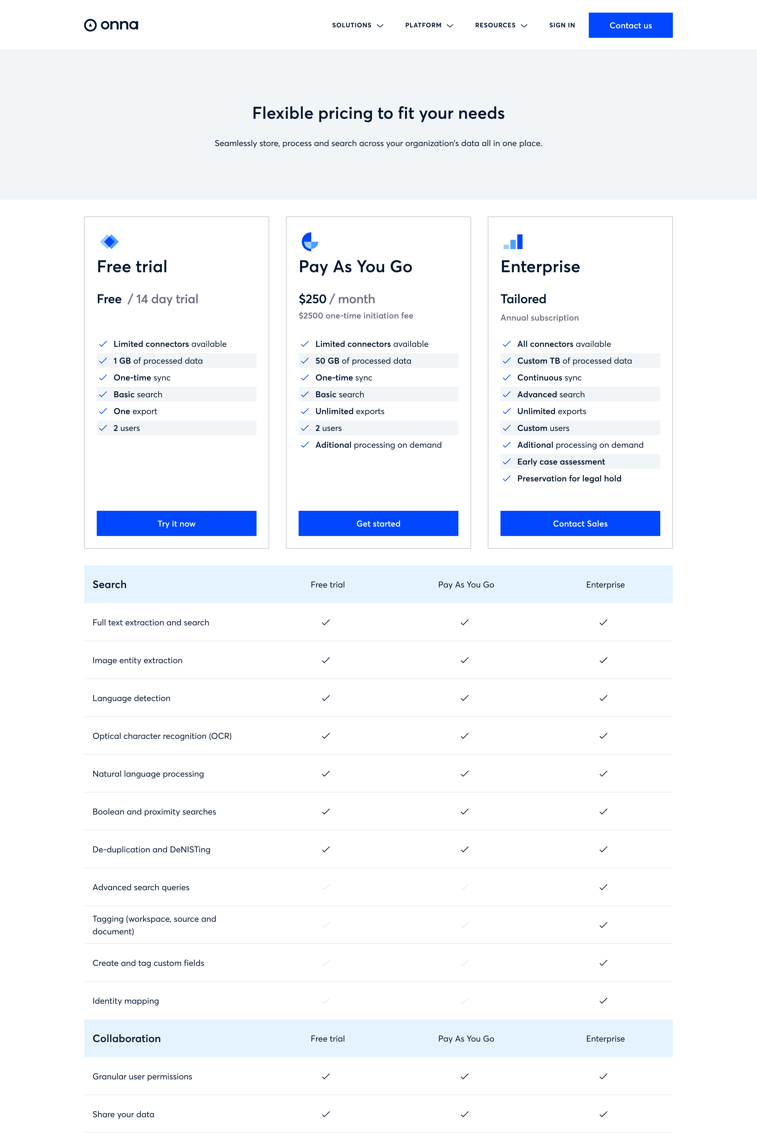
We restructured the pricing page into three clear tiers:
-
Free Trial
-
Pay-As-You-Go
-
Enterprise
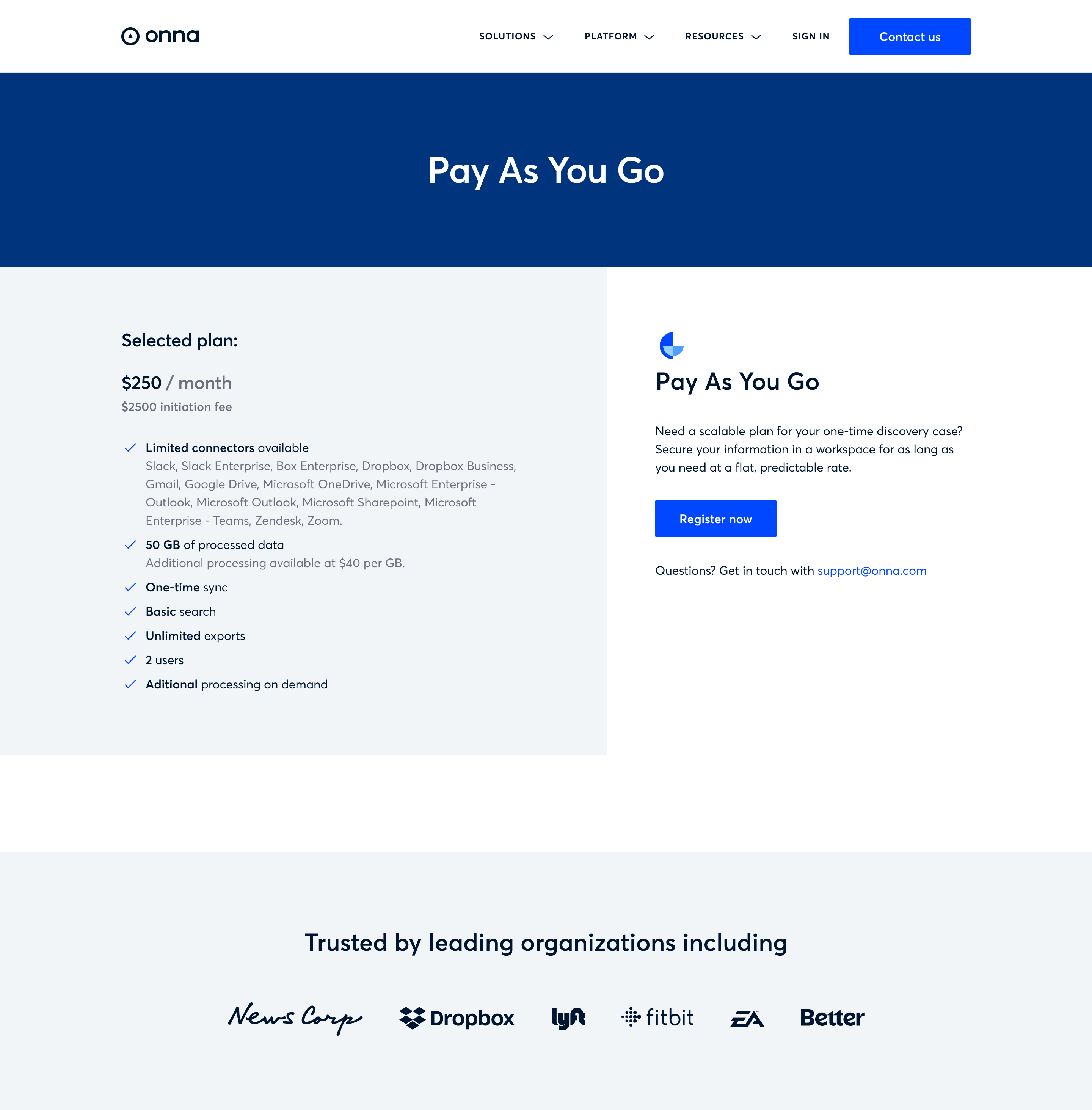
Each had its pricing card, value summary, and CTA. The comparison table was grouped by functionality (Search, Collaboration, Security, Support) with checkmarks replacing dense text. To avoid overload, we moved deeper information to dedicated plan detail pages, allowing us to keep the main page clean while supporting high-intent users who needed to dive deeper.
Visual Trust & Brand Alignment
We showcased customer logos, embedded testimonials, and matched the design to Onna’s refreshed brand, adding polish and credibility to the experience.
Mobile Innovation
The old pricing page didn’t work well on small screens. I introduced a new tab-based mobile layout that lets users easily swipe between plans, mimicking a native app experience. This small shift led to a major improvement in user engagement and retention.

Conversion-Focused CTA Strategy
CTAs were repositioned and rewritten for clarity. We added:
-
A sticky mobile CTA bar
-
A persistent “Contact Sales” section for Enterprise users
-
Inline “Get Started” buttons for fast activation
Outcome & Impact
The new pricing experience launched in Q3 and quickly outperformed expectations:
-
📈 +65% increase in Free Trial sign-ups
-
📉 -32% reduction in bounce rate on pricing pages
-
📱 +40% increase in mobile engagement time (from 0:52 to 1:29 avg.)
-
💼 +23% increase in Enterprise “Contact Sales” submissions
The new design not only helped users find the right plan — it made them feel confident about the product and how to take the next step.
Key Takeaways
This project reinforced some core principles in my product design approach:
🧠 Clarity wins — when users are overwhelmed, they don’t convert. Simplifying layouts, language, and interactions helped remove friction.
📱 Mobile-first thinking is essential — our mobile tab design was one of the most impactful decisions we made.
🤝 Cross-functional collaboration drives better outcomes — alignment with PMs, engineers, and customer teams helped ensure we built something that worked for the business and the user.
Reflection
This wasn’t just a facelift. The redesigned pricing page is now a strategic asset, helping Onna convert, retain, and scale. It serves as both a self-serve gateway and a trust-building tool for complex buyers.
I’m especially proud of how we transformed a high-friction experience into something elegant and user-friendly, all while respecting the complexity of an enterprise product.