

Fizza is a fitness app that helps people to exercise and stay motivated. Even the name of this platform is a fusion of fitness and pizza (you can have a slice or two during your cheat-meal day and don’t feel bad about it)
UX
Building Fizza was an interesting and challenging journey. I described the research stages of this project on Medium. You can find the detailed descriptions of the interviews, collected insights and very first ideas at empathise and ideation posts.
I discovered several things after interviewing my target users.
- Users clearly prefer mobile.
- A lot of people use a fitness app and most of them don’t use a nutritional app.
- Most of users have a fitness goal.
- Most of participants responded that they believe that a fitness coach is important.
- A huge number of users believe that motivation is a key.
- A lot of users aren’t satisfied with their previous fitness and diet experiences.
- Users seem to be interested in a customised fitness plan made just for them.
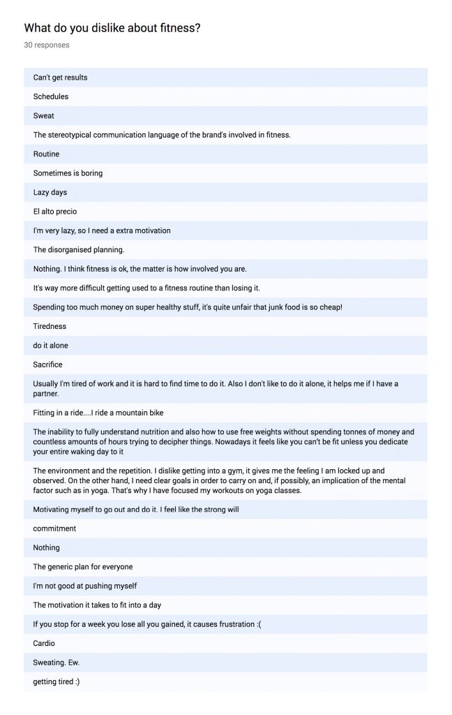
- The last question was what people hate about fitness, and these were the answers:
Also I wanted to know how the schedules of the users and their lifestyles influence on their fitness decisions and how can I help build healthier habits. What is the pattern that turns down our fitness routines?
I asked about the customised fitness plan made just for them and many users said: “Yes”. During the interviews I found out that many people are interested but aren’t about to follow it. Many of them don’t want any strict program, but they want a guide. All of the interviewed persons were pointing on motivation and exercise. I’ve got very interesting insights about doing what you love and doing what is fun. I listened about how people try to fit exercising into their routines and what are the things they struggle the most and decided to build a platform that will offer better fitness experiences.
To define it even better I used several tools such as: Mind Map, Affinity Map, UX Strategy and Lean UX Canvas. All these tools helped me to come up with a problem statement:
People who don’t workout regularly need a way to get motivated to exercise because most of them have difficulties getting used to a fitness routine.
User persona
My user persona is Emma. She is 30 and she works from 9am to 6pm. She has a lack of motivation to exercise.
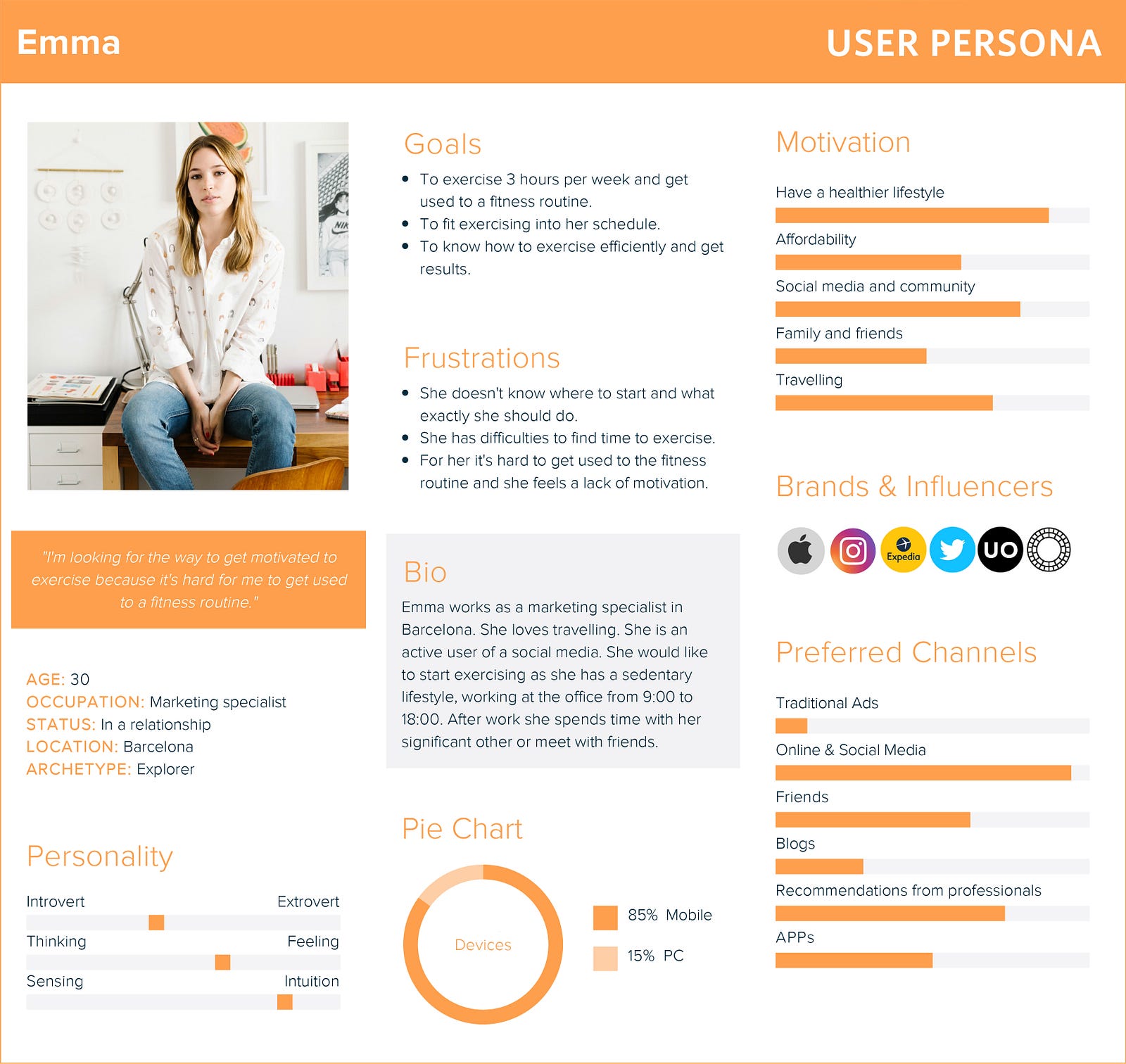
The empathy map and the user journey map helped me to define the core stages during Emma’s experience with the tool I’m developing and create the first sketches of the app.
The App
During working on the first sketches I started to build a site map and flows. Taking into account all the data I collected during the research phase there are several points that I wanted to include:
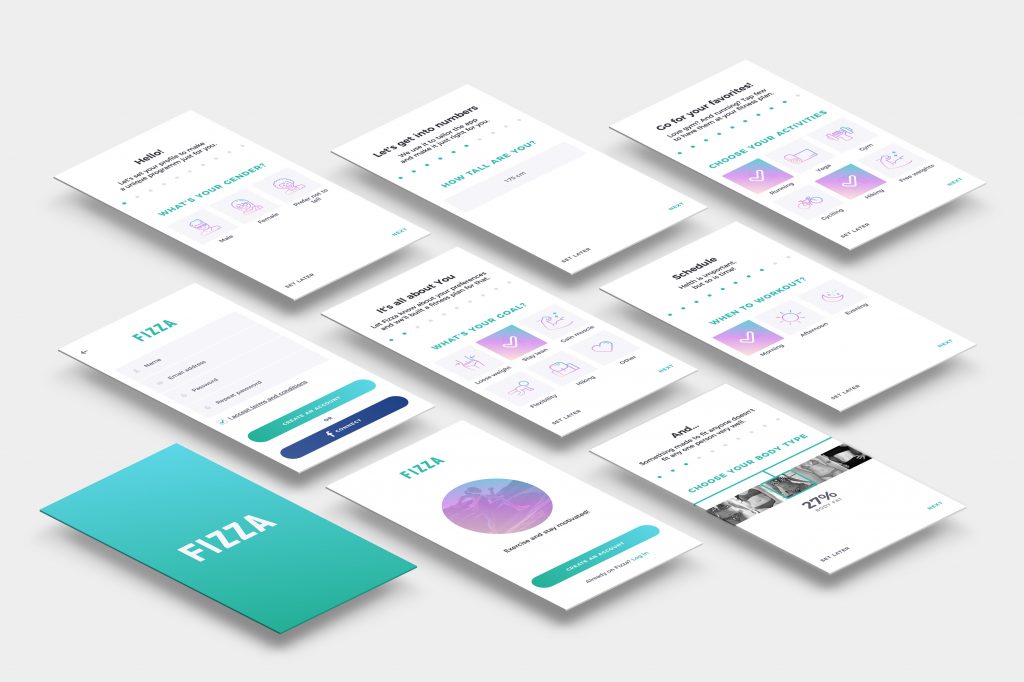
- The app need to have an on-boarding to define user’s preferences and goals and be able to offer a personalised doable program. This part will consist of several screens with questions about body type, schedule preferences, favourite sports and goals. This way the platform will analyse data and offer a realistic plan for the user to help reach the goal.
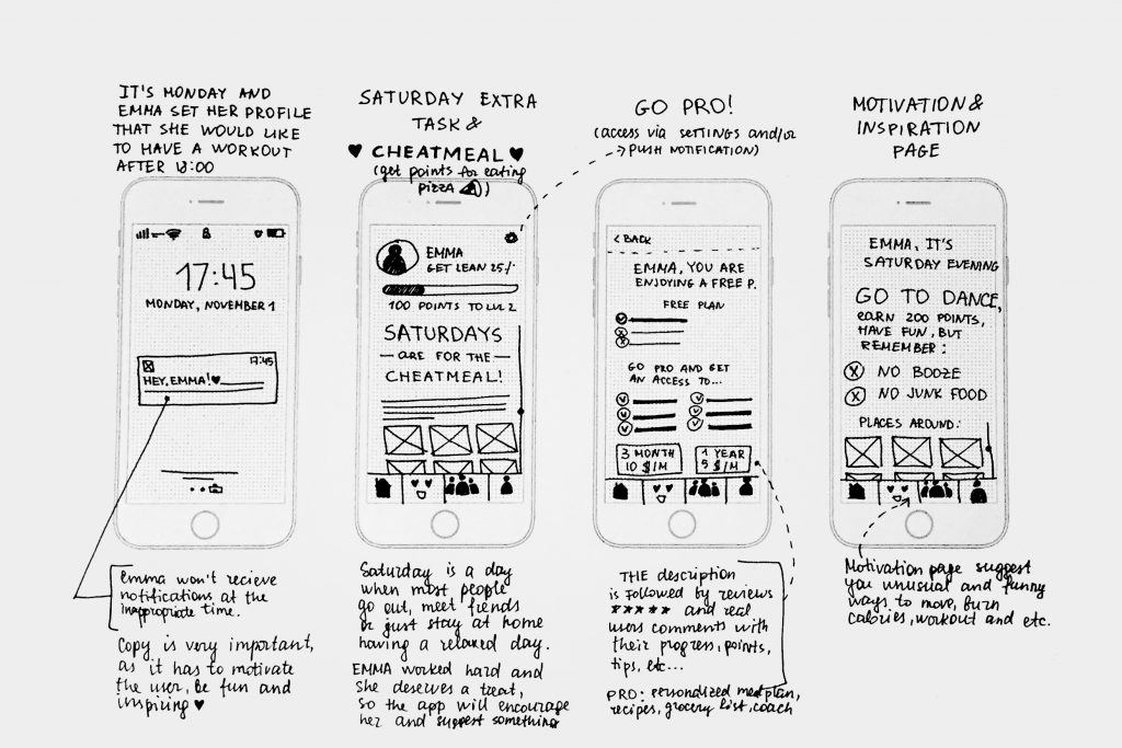
- The app has to have strong motivational aspect as for many users it’s challenging to follow the fitness routine. Fizza will offer a community feature and funny challenges with badges and points. Also the app offers a cheat-meal day as Fizza is a very human-centred platform.
- Fizza follows several principles that allow user to discover the unique content of workouts, motivation and fun. The platform will have multiple entrances with the bottom menu at every screen that includes 3 main categories: Dashboard, Challenges and Community.
Testing
After finishing the low-fi sketches I made a first user-testing with the 5 people from the target group. These were the situations I described to see if it was easy to complete the tasks:
- Imagine you already used this app before, but you don’t remember your password, how would you proceed? (completed by 5/5)
- How would you proceed to complete your first workout? (completed by 4/5)
- Imagine you want to discover another users, how would you proceed? (completed by 4/5)
- Imagine you had a long day at work and you want something extra to make you feel a bit better, how would you proceed? (completed by 4/5)
- If you would like to know about your personal progress, where would you look for it? (completed by 3/5)
The findings
General:
- At some screens the buttons should be more evident / bigger.
- Some users commented that they don’t have it clear what’s the most important of this app. So I should rethink a dashboard to make it clearer.
- Some users have the icons unclear, so there is a need of labels.
- One user commented that the badges have to be inside the profile and not inside the motivational section. As it’s something that belongs to the person and feels like personal progress.
On-boarding:
- Some users asked about the questions during the on-boarding as it seemed a sensitive data to them. So I shall include a phrase that these questions are for making a personal training plan and schedule. It wasn’t clear from the beginning. The user found out about it only at the end of the questionnaire with the feedback/result page.
- 5 from 5 users were frustrated with the unclear schedule question. The screen looked complicated to all the users who tested the prototype.
- One user commented that it was too many steps/clicks and he would prefer to have less questions.
Feedback:
- Some users commented that they would like to have a training marked as “done” when it’s completed at the training page. There is a list of exercises and it was unclear for the user.
UI
After testing I worked on several adaptations to make the experience better and tested with the same questions using the mid-res prototype. It gave very good results and I started to work on the UI.
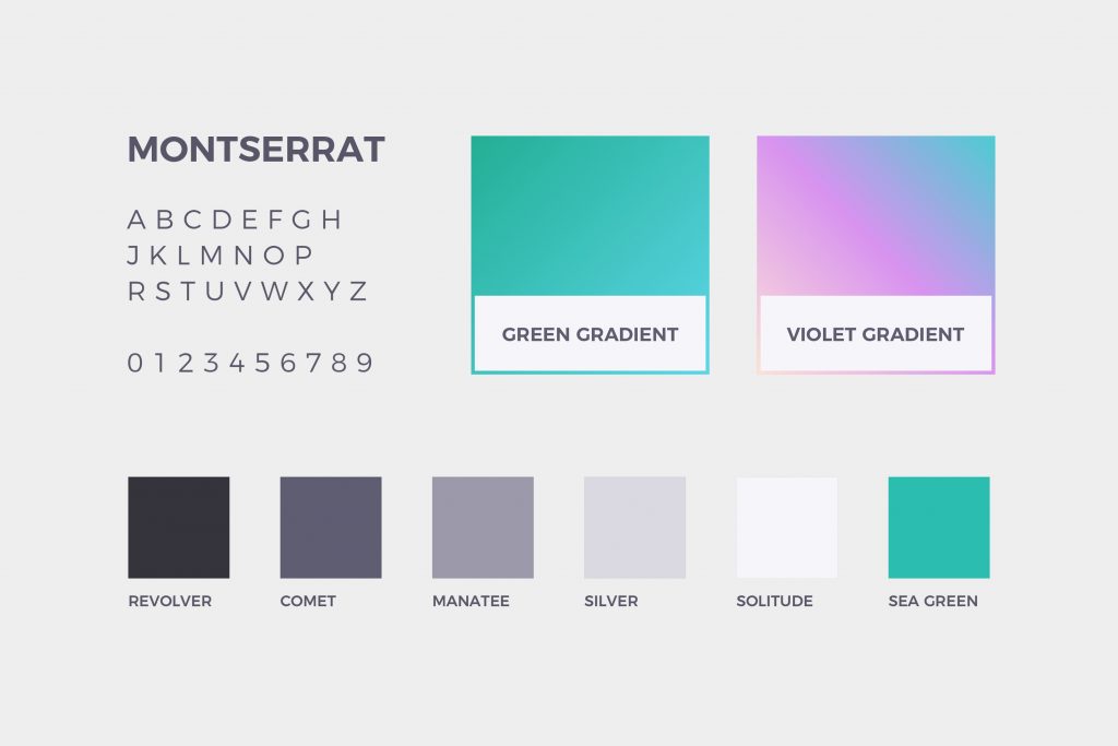
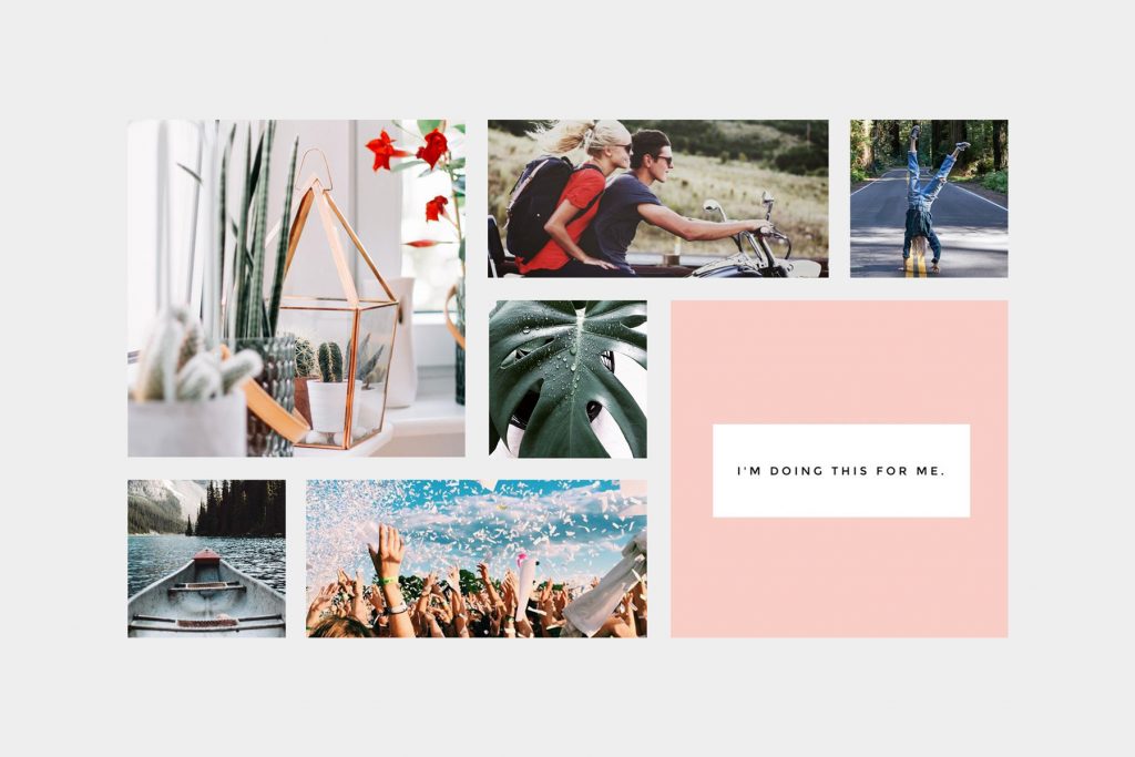
I started with the mood-board to define colours, typography and the general mood. The idea is to make Fizza look friendly, fun and clear. Afterwords I defined the visual weights, designed icons and created atomic UI patterns for this app.
On-boarding
There are 10 screens for on-boarding with the possibility to drop from the each screen and complete it later. Every question offers few clear options easy to answer.
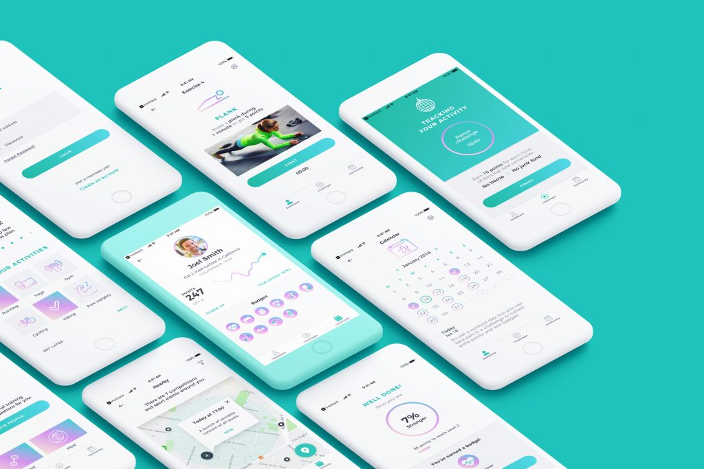
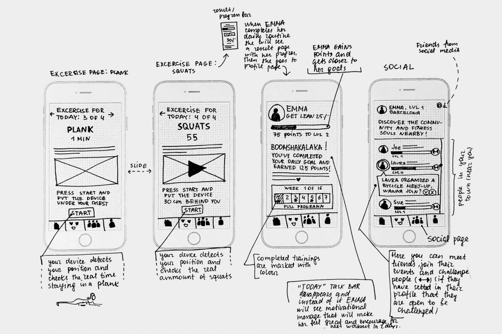
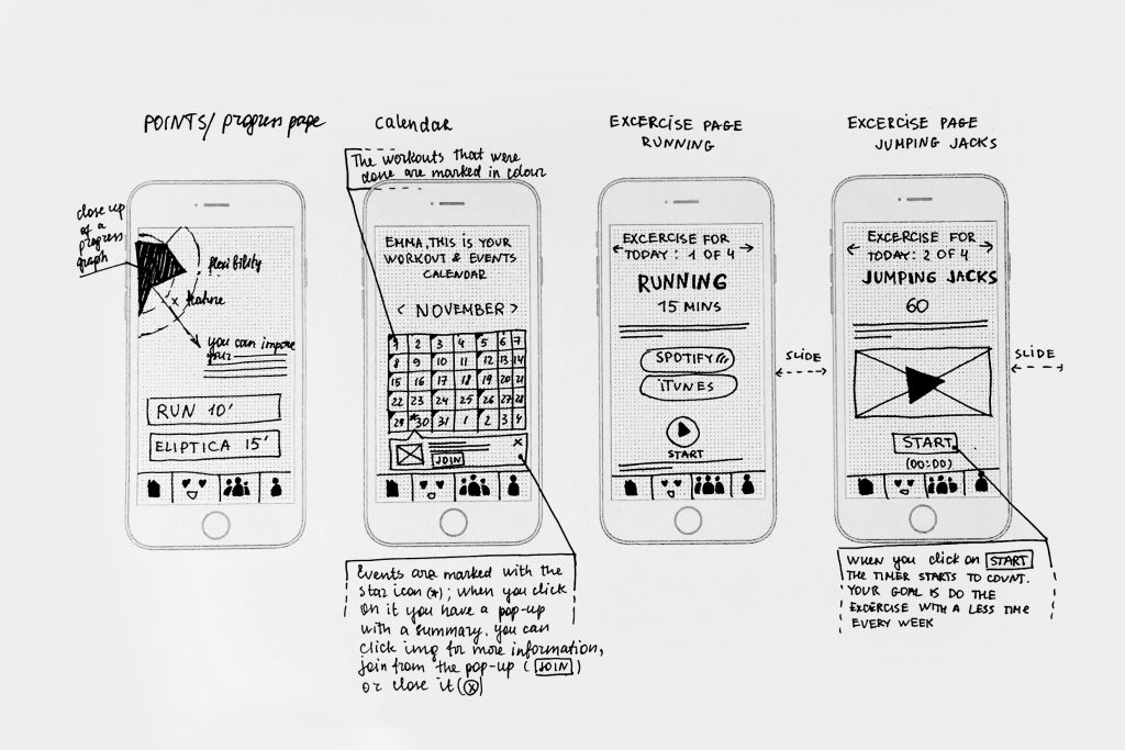
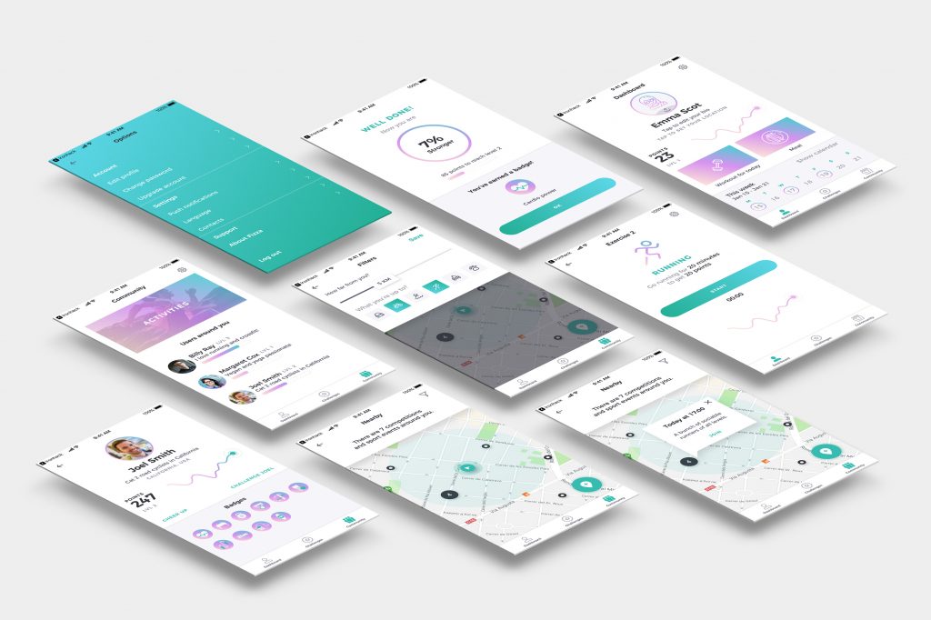
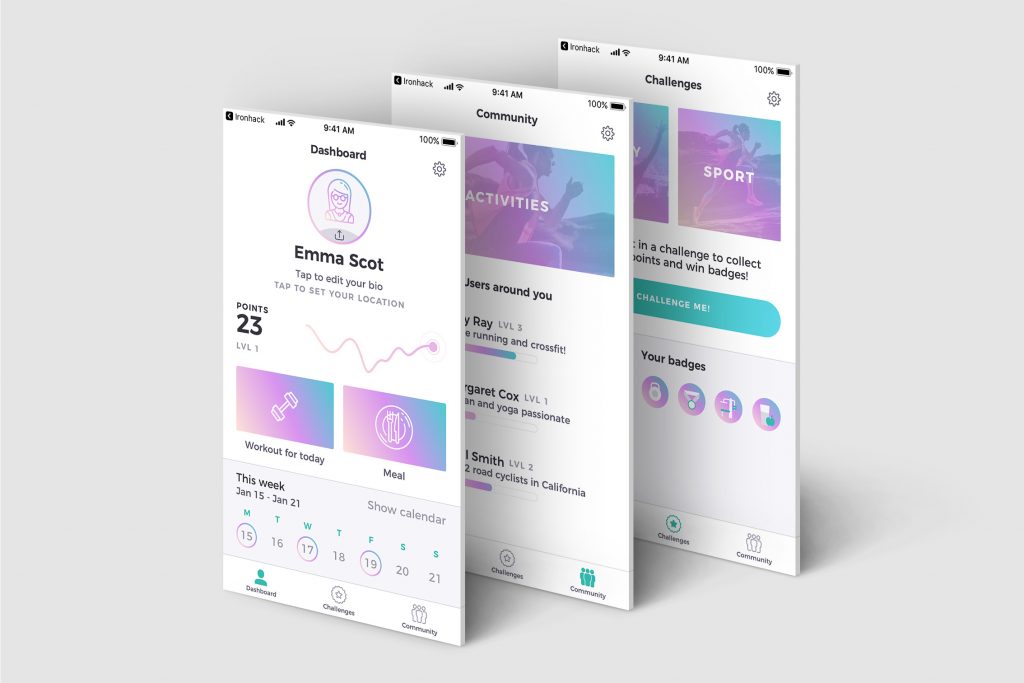
Dashboard
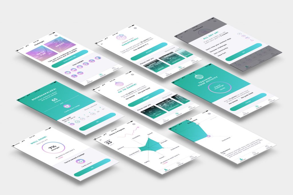
Afterwords a user gets to the dashboard where 2 main actions are highlighted with the violet gradient. It’s a workout button and a meal button. Also from here a user can access to the personal progress graph and see when are the workout days this week. Personal progress page will display several aspects of fitness and will give tips how to improve one or another.
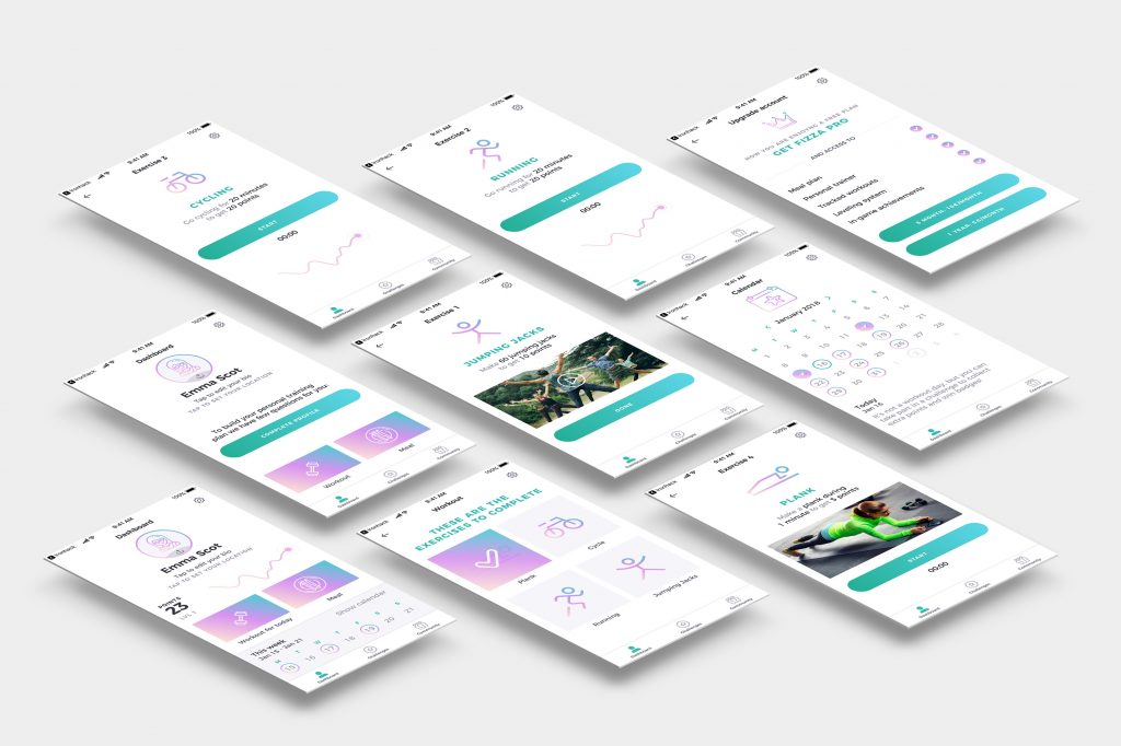
Workout
The workout page offers few exercises, and each completed exercise is marked as done with a big check icon. I was looking to give feedback and motivation all the time. Also, a user will get a summary after completing every exercise, and will be specially cheered up after every completed workout.
The exercises provide images, videos or descriptions to make it clear and easy-understandable. Some of the exercises include timer to track and measure progress.
Challenges
The app is highly focused on motivation, so there are several features that help users to keep the good mood. Constant feedback, badges, gamification, funny challenges as go clubbing or have a cheat-meal day. And earning points for all of it, of course!
Community
Community is very important too. Fizza users will be able to meet up for the activities they like, make running friends, attend yoga classes and many more. Also there are competitions where a user will be able to challenge a friend.
Error pages
Aside from the main UI screens I designed the empty state and error pages. I focused on giving a clear message to the user and suggest a solution.
Fizza was tested and several things were implemented. I made the buttons bigger, also I changed the text’s colour to the darker shade of grey as before there was not enough contrast. You can have a look at the prototype for yourself: Invision
Here you can check:
- Summary presentation
- Invision prototype
- Empathise phase – post in Medium.
- Ideation phase – post in Medium.